

A windowless bedroom is one of the hardest rental problems to solve. There is no natural light, the room feels like a closet, and the paint color matters more than it would in a room with a window. I had this exact problem: a converted dining room in a 1920s fourplex, 9 by 11 feet, with a hollow-core door and no window. The only light came from a floor lamp, a table lamp, and a 4-inch gap under the door.
I wanted to repaint the room, but first I wanted to know which color would actually make the space feel bigger. I tested a range of candidates on the wall—several whites, two warm off-whites, a rental beige, a chalky sage, and two dark colors—and lived with each one for a day or more. The lesson applies to any windowless rental room: the color has to match the effect of your light on its undertones, not the paint chip you saw under store fluorescents.
A quick caveat before the details: this assumes your lease allows you to paint, or that you are willing to repaint the room back to white at move-out. If your lease does not allow painting, you can still test colors with large poster boards painted with sample-size cans — lean them against the wall in the room's actual lighting and see how they look. You do not have to commit to a whole gallon to find the right color.
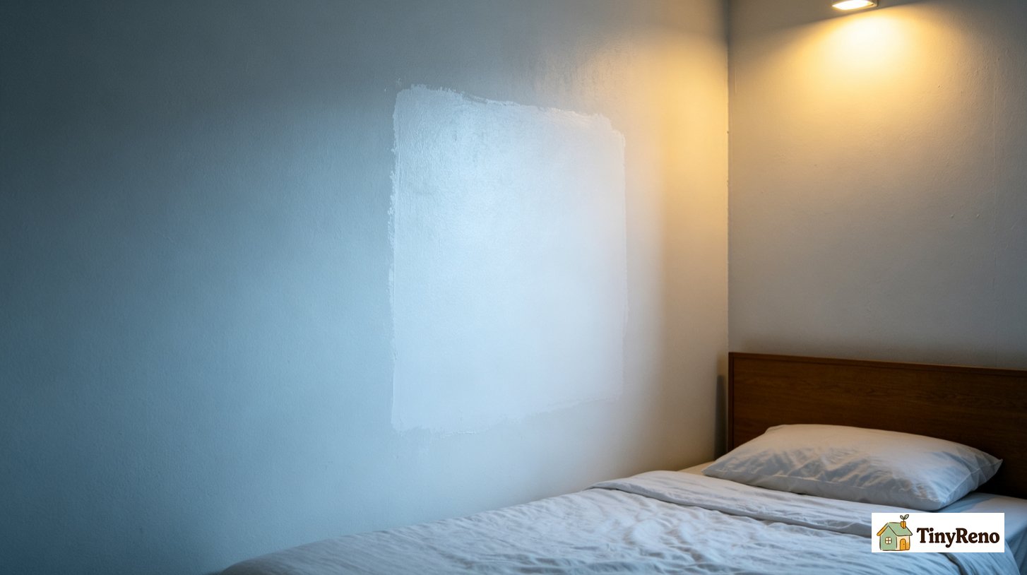
The first rule: paint looks different under your light
The most important thing I learned is that the color you see at the hardware store is not the color you will see in your room. Paint chips are printed under bright fluorescent store lighting. Your bedroom has warm LED bulbs, cool white LEDs, or just a lampshade. Two properties explain what happens next: light reflectance value (LRV), which determines how much light the wall bounces back, and undertone, which determines whether the reflected light reads warm, cool, or neutral. A high-LRV color reflects more light and makes the wall recede; a low-LRV color absorbs more and makes the wall feel closer[reference:3]. Undertone decides whether that reflected light feels creamy or icy.
This is why you always test a sample on the actual wall, in the actual room, under the actual light you use at night. A bright white that looks clean at the hardware store might look cold and blue under warm bedroom light. A creamy off-white that looks yellow on the shelf might look perfect under your lamp.
The practical rule is not simply “warm light, warm paint.” Warm light (around 2700K) amplifies creamy, yellow, and peach undertones, making whites softer; cool light (around 5000K) emphasizes blue and gray undertones, making colors crisper[reference:5]. The real question is whether you want the wall to reinforce the lamp’s cast or temper it. In a windowless room, a warm off-white under warm light usually reads as cohesive and inviting. A cool white under warm light can read flat or gray-blue, because the lamp is pulling the wall toward a temperature the paint does not have. The wall does not have to “match” the bulb, but it should not fight it.
The bright whites: they made the room feel smaller
I started with two bright whites, the kind that paint stores call "pure white." The first was a cool, clean white that apartment buildings use in vacant units because it looks fine under fluorescent lights. Under my warm bedroom lamp, it read flat and slightly blue-gray. The high LRV was not the problem—it was actually doing its job of reflecting light and pushing the wall back visually. The problem was the undertone: the lamp was warm, the paint was cool, and the combination drained the wall of any warmth rather than making the room feel larger in a way that also felt livable.
The second white was a similar stock white from the home improvement store. Same problem: cool, flat, slightly gray under warm light. It looked like a piece of printer paper taped to the wall, and it made the room feel smaller, not bigger.
The lesson: bright, cool whites are not the answer for a small windowless room with warm light. They look clean in a hallway or an office, but in a bedroom, they feel cold and clinical. Skip the "pure white" if you have warm bulbs.
The warm off-whites: these made the room feel livable
The first warm off-white I tried was a soft ivory with a touch of warm gray. Under the lamp, it reflected the warm light back at the same temperature. The wall felt deeper, softer, less stark. It was the first color that did not make the room feel like a box.
The second warm off-white was a creamy, almost buttery ivory. It looked slightly warmer than the first one, and under the two lamps the room felt cozy, like a nice hotel room. It was the kind of color that makes you want to sit down on the bed and read a book.
Both of these warm off-whites worked because they matched the color temperature of the light. The warm light hits the wall, and the wall reflects warm light back. There is no contrast, no cold spot, no visual discontinuity. The wall just feels like part of the room.
If you want the safest choice, go with a warm off-white. It is the color that interior designers recommend for small rooms for a reason: it reflects light evenly, it does not clash with warm bulbs, and it makes the space feel bigger without being stark.
The rental beige: livable, but not special
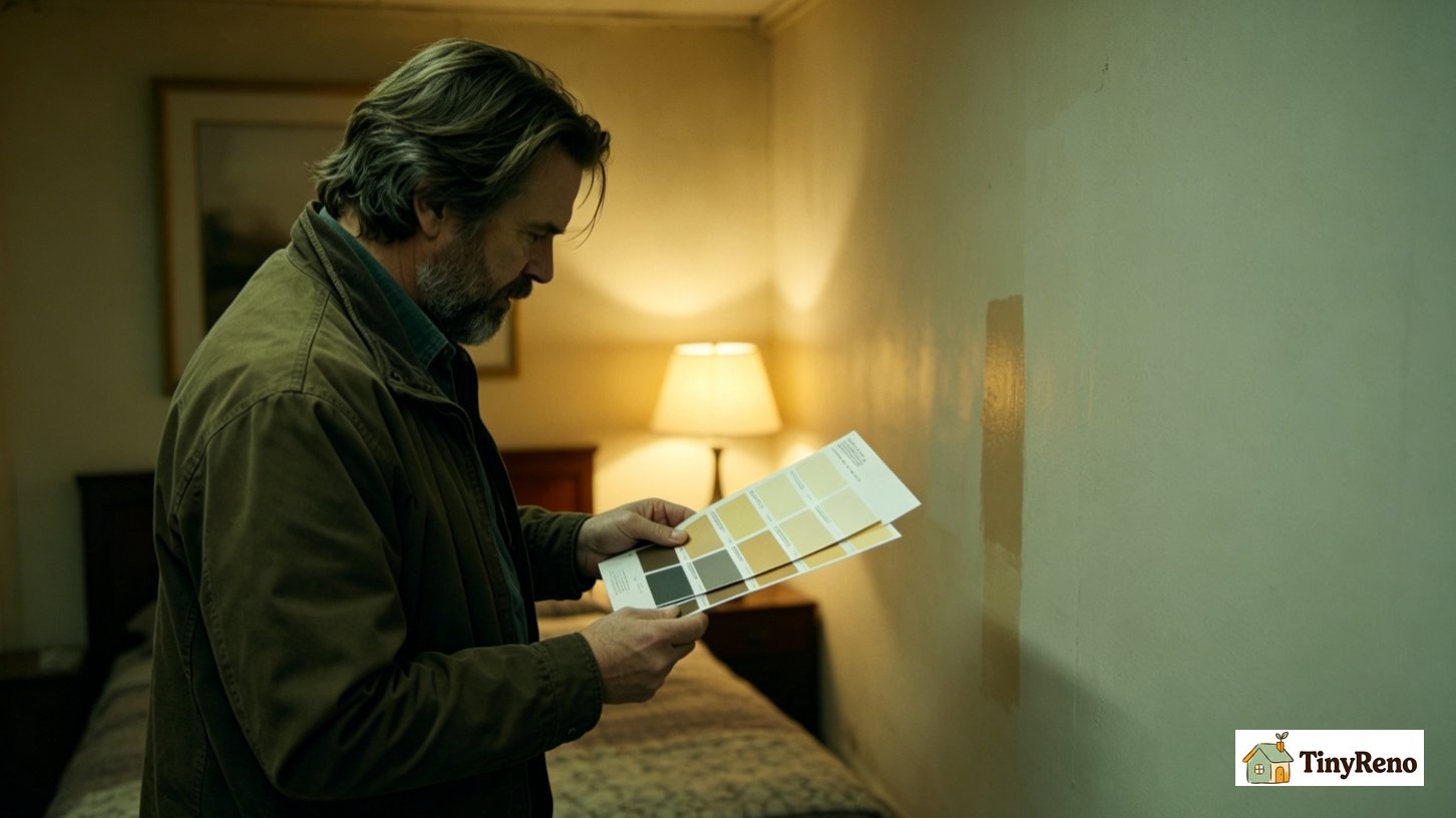
The next color I tried was the kind of beige that landlords buy in bulk — a soft, warm tan that covers in one coat and forgives bad drywall. It is the color of a thousand rental apartments across the country. The beige had a decent LRV and did not actively shrink the room, but it receded in a different way: it disappeared rather than expanding. The room felt fine, not bigger. It did not feel like my room. It felt like the room the property manager had chosen for everyone.
This is not a bad thing. If you want something neutral that you will not get tired of, and you do not want to make a statement, the rental beige works. It is safe, it is forgiving, and it is the color your landlord would have chosen anyway. But if you want the room to feel like yours, you need something with a little more personality.
The chalky sage: the surprise
The last color I tried was a muted, chalky sage green — a soft green with so much gray in it that it almost reads as a neutral. I did not expect to like it. I was testing it because a painter friend suggested it, saying he had used a similar color in a windowless bathroom and it worked.
It was the surprise of the whole experiment. Under the warm lamp, the sage absorbed the light and gave back a quiet depth. The wall felt wider, not smaller. The room felt calmer, not like a closet. It was a neutral with personality — not a color that shouts, but a color that has a point of view.
The sage worked because its low saturation and grayed-out undertone did not fight the warm lamp, and its LRV was high enough to keep the wall from visually closing in. The green was muted enough to absorb warm light and return it as a soft green-gray rather than a sharp hue. It was not the safest choice—a bad sage can read institutional—but if you test it in your actual light and it looks calm rather than clinical, the risk is mostly aesthetic, not spatial.
This is not the safest choice — if you pick the wrong sage, you can end up with a wall that feels like a hospital waiting room. But if you test it on the wall first, in your actual light, and it looks good, it can make a windowless room feel intentional and calm, instead of just small.
The dark colors: they shrank the room
I tested a deep navy and a forest green on separate boards, leaning them against the wall. Both of them absorbed so much light that the wall felt like it was closing in. The navy looked like a black hole under the lamp. The green felt heavy and dark.
The standard advice is that dark colors make a small room feel smaller, but that is not automatically true. In a windowless room with only a few warm lamps, a low-LRV cool dark color absorbs most of the light that reaches it, leaving little to bounce back. That is the mechanism behind the “cave” feeling—not darkness itself, but darkness without enough light to articulate the space. A deep warm color can work in a low-light room if you have layered artificial light, but in a rental bedroom lit by one floor lamp and one table lamp, a cool navy or forest green will read as a wall that has stopped participating in the room.
A deep warm color — like a warm charcoal or a deep chocolate brown — might work in a windowless room if you have enough light. But cool dark colors, like navy and forest green, will make a small room feel like a cave. Skip them.
For a rental with a windowless bedroom, the most reliable starting point is not just “high LRV” but “high LRV with a warm undertone.” A warm off-white reflects as much of your limited light as a cool white does, but it does not turn gray-blue under a 2700K bulb. Test it on the wall under your actual lamp light, at night, when you normally use the room. If it reads warm and open rather than flat, go with it. That combination—light reflectance plus undertone compatibility—is what makes a windowless room feel larger without also feeling clinical.
If you want something with a little more personality, test a chalky, muted color like a soft sage or a warm taupe. Again, test it on the wall first, under your light. Do not pick it based on the paint chip at the store.
Skip the bright cool whites, skip the dark cool colors, and skip the pure whites that feel flat under warm light. And if your lease does not allow painting, use poster boards with sample paint — you can test the whole effect without committing to a gallon.
I kept the warm off-white. The sage stayed on the wall for a few weeks and I liked it, but the off-white made the room feel larger with less risk of reading wrong under the lamp. That is the trade: a warm neutral maximizes perceived space and minimizes undertone risk; a muted sage adds depth and personality but depends more heavily on testing and personal tolerance. For a windowless rental bedroom where “small” is the main problem, the warm off-white is the lower-risk answer.


Discussion (0)
Sign in to join the discussion