

I painted my first small bedroom at 19 and ended up with a wall color I can only describe as "aggressive hospital mint." The room was maybe 10x11 feet, and that mint green sucked every photon of light out of it for the entire afternoon. I lived with it for six months because I was broke and lazy, and during that time the room felt smaller than it was and I felt smaller in it. Both effects were real. Both went away when I finally repainted.
The reason small rooms punish bad color choices harder than any other room in the house is that they don't have visual forgiveness. A 20x20 living room can absorb a slightly-too-saturated accent wall because the eye has distance and furniture and competing focal points to look at instead. A 10x11 bedroom has one wall behind the bed, three walls you can touch with your arms out, and almost nowhere for the eye to escape. Every color choice in a small room is amplified — for better or worse.
This article is about the color choices that consistently work in small rooms, the three popular picks that consistently don't, and a way to test a color in your actual room before you commit to a gallon.
Why Small Rooms Are the Most Forgiving Space to Paint Wrong
Before I get into specific colors, there's something counterintuitive worth understanding: small rooms are also the cheapest spaces to repaint when you get it wrong.
A gallon of paint covers about 350 square feet. A typical small bedroom has 350-450 square feet of wall surface, which means one gallon handles the entire room with some left over. A repaint costs $30-40 in paint plus a couple of hours of your time. Compare that to a 20x20 living room where a wrong color choice means 600-700 square feet of wall surface and 2-3 gallons to fix.
This is the actual reason small rooms are good places to experiment with color. The financial downside of getting it wrong is small enough that you should treat the first color choice as a draft, not a commitment. Most people don't, because they think repainting is a bigger project than it actually is. Once you've done it once — primer, two coats, four hours total — you stop being afraid of color.
The other thing that makes small rooms forgiving is that any color looks intentional at small-room scale. A bright cobalt blue wall would look ridiculous in a 20x20 living room. The same cobalt blue in a 10x10 bedroom reading nook is just cozy. The room is small enough that the wall color doesn't dominate; it shares space with the bedding, the curtains, the furniture, and the light coming through the window. Use this.
The "60-30-10" Rule That Actually Works in Small Rooms
If you've ever looked at interior design advice, you've seen the 60-30-10 rule. Most explanations of it are written for designers working in large spaces with lots of furniture, multiple textile layers, and architectural details to anchor each color. In a small room with one window and a bed, that version of the rule doesn't translate.
Here's how it actually works in a small bedroom:
60% — the dominant color. This is the wall color. Most small bedrooms have one or two walls of the dominant color, or the same color on all four walls if you're going neutral. This color sets the room's overall temperature — warm, cool, calm, energetic. Most people pick a wall color that's slightly more muted than they want, because the wall color reads stronger at small-room scale than it does in the paint store.
30% — the secondary color. This is your bedding, curtains, and large furniture. Pick a color that contrasts gently with the wall — if the wall is warm cream, the bedding might be soft sage; if the wall is pale dove gray, the bedding might be warm blush. The 30% color doesn't have to "match" the wall, but it should sit in the same color family (warm with warm, cool with cool).
10% — the accent color. This is your throw pillows, art, a single lamp, a stack of books. The accent color is the only place you should put anything high-saturation. It's the punctuation, not the sentence. Most small rooms look more pulled-together when the 10% color is something already present in the 30% color — a slightly brighter version of the bedding, or a complementary tone.
For a room where you want one dark or saturated wall, the rule shifts: 40% wall color (the three lighter walls) / 30% secondary / 20% the dark accent wall / 10% small accent details.
8 Paint Colors That Make Small Rooms Feel Bigger
These are the colors I've either used myself, watched renters use successfully, or seen consistently recommended by designers who specialize in small-space work. The list isn't exhaustive — there are dozens of off-whites and pale sages that all work for similar reasons — but these eight cover the bases for most small-room situations.
Soft warm white (Benjamin Moore White Dove, Sherwin-Williams Alabaster, Behr Swiss Coffee). The safest pick in any small room, but "soft warm white" is doing more work than it sounds. Pure bright white reads as cold and sterile in a small bedroom; warm whites have a slight yellow or cream undertone that makes the room feel inviting and reflects the warm color temperature of typical bedroom lighting.
Pale dove gray (Benjamin Moore Pale Oak, Behr Silver Drop). A barely-there gray with a warm undertone. Works in north-facing rooms that need a touch of warmth to compete with the cool natural light. Avoid grays with blue or green undertones — they go muddy fast in small rooms with limited light.
Muted sage green (Behr Sage Wisdom, Benjamin Moore Salisbury Green). A soft green that reads almost gray from across the room. Calming without being boring. Pairs with natural wood furniture and linen bedding.
Dusty blue (Benjamin Moore Smoke, Behr Misty Blue). A gray-blue rather than a true blue. Good for north-facing rooms where you want the room to feel cooler, or south-facing rooms where you want to bring in some color contrast against the warm light.
Soft blush (Behr Pink Persimmon, Farrow & Ball Pink Ground). A barely-pink that reads almost neutral. Works in bedrooms specifically, especially with white or cream bedding. Avoid in living rooms where the pink reads more obviously.
Warm cream (Benjamin Moore Natural Cream, Behr Almond Wisp). A step warmer than soft warm white. Pairs with brass accents and natural wood. Works in any small room but especially in north-facing rooms that need warmth.
Pale terracotta (Behr Copper Pot, Sherwin-Williams Cavern Clay). A muted orange-brown. Surprisingly versatile in small rooms with warm wood tones or terracotta tile in adjacent spaces. Don't overdo it — one accent wall, not all four.
Barely-there lavender (Benjamin Moore Pale Lavender, Behr Lavender Sachet). Works in east-facing rooms where morning light adds warmth. Reads almost gray from across the room but has a subtle cool tone that's calming for bedrooms.
The 3 Colors That Always Shrink Small Rooms (And Why Pinterest Loves Them)
If you've spent any time looking at small room inspiration online, you've seen these three colors recommended over and over. They look great in curated photos. They look terrible in real small rooms.
Pure bright white (Behr Ultra Pure White, Sherwin-Williams Extra White). The Instagram favorite. In photos, it looks crisp and modern. In real rooms with real lighting, it reads as cold and clinical, and the lack of any warm undertone makes the room feel exposed rather than cozy. The exception is rooms with lots of natural light and warm wood furniture — those can pull off a brighter white. For most small bedrooms, a soft warm white reads 10x more inviting and still feels "clean and modern."
Cool gray with blue undertone (Benjamin Moore Stonington Gray, Behr Silver Strand). These grays look beautiful in designer showrooms. They look gray-blue in real rooms, especially in north-facing light, and the cool tone competes with the warm wood and bedding most small rooms have. The result is a room that feels slightly off — not cold, not warm, just unsettled. Warm grays (with a beige undertone) work; cool grays almost always don't.
High-saturation accent wall on all four walls. This one isn't a color, it's a pattern: the "painted the entire room dark teal because it looked great in a magazine" mistake. The room reads as a box. A single dark accent wall makes the room feel layered; four dark walls makes it feel enclosed. I've watched people make this exact mistake three times in different apartments. They always repaint within a year.
The reason Pinterest loves these colors is that photography flatters them. Bright whites photograph as crisp and modern. Cool grays photograph as sophisticated. Saturated dark walls photograph as dramatic. None of these are how the colors feel in person when you're sitting in the room at 7 a.m. with the morning light coming through one window.
Light Direction Changes the Answer
The same color looks different in different rooms, and most of that difference comes from the direction the windows face.
North-facing rooms. Cool natural light year-round. Pick warm colors (warm whites, soft sages, warm creams) to balance the cool light. Avoid cool grays and bright whites — they amplify the cold feeling.
South-facing rooms. Warm natural light, lots of it. Pick cool colors (dusty blue, soft sage, pale dove gray) to balance the warmth and prevent the room from feeling yellow. Avoid heavy warm colors (terracotta, mustard) on all four walls — they'll feel oppressive by afternoon.
East-facing rooms. Morning sun, cooler afternoons. Pick mid-tone colors that work in both. Soft blush, muted sage, and barely-there lavender all handle the morning-to-afternoon light shift gracefully.
West-facing rooms. Afternoon sun, cooler mornings. Pick colors that don't get blown out by the strong afternoon light. Dusty blue and pale gray work; warm cream works if you want a cozy evening feel.
The cheapest way to test this is to put a sample pot of your color on each of the four walls and look at it at three times of day — morning, noon, and evening. The wall that gets the most consistent light is usually the best one to sample against.
The "Sample Pot Sunday" Test
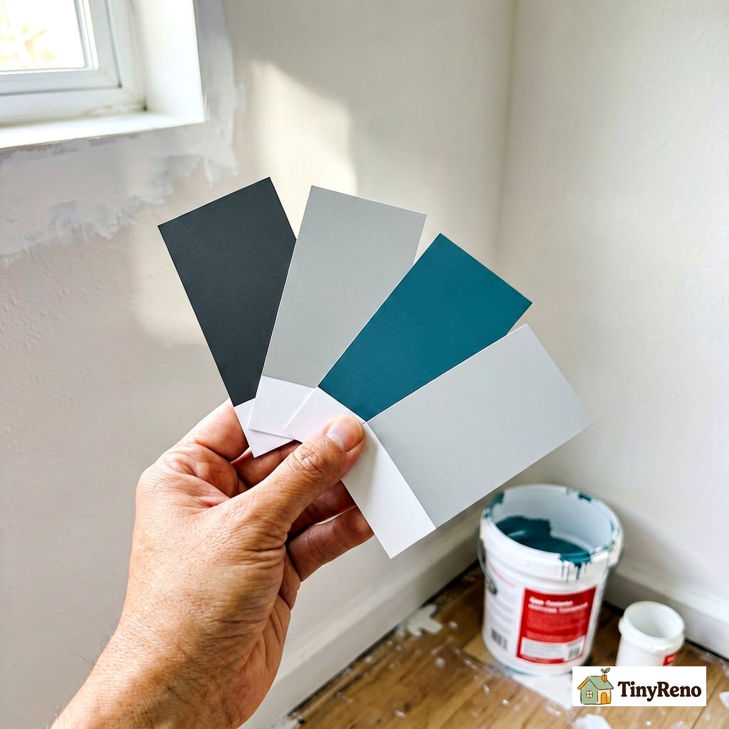
The final test that catches what the paint chip never will: live with five candidate colors on your actual walls before buying a gallon.
Here's the routine that takes one afternoon:
- Buy five sample pots of the colors you're considering. Sample pots cost $3-5 each and cover about 4 square feet — enough for a 12-inch square patch on the wall.
- Paint each patch on a different wall of the room, ideally one patch per wall. Label the patches with the paint name and brand using a small piece of masking tape.
- Live with the patches for three days. Don't look at them on the day you paint — they look different wet, and you'll second-guess every choice.
- On day three, stand in the doorway and look at the room with all five patches visible. The color that disappears into the room (rather than announcing itself) is usually the right pick. The color that you keep noticing is usually too saturated for the space.
- Once you've picked, paint a 2-foot square of the winning color in a less visible spot (behind a door, inside a closet) and leave it for one more day. This is the final check before buying the gallon.
The whole process costs $15-25 and one Sunday. It catches the color that looks great on the chip but reads as "aggressive hospital mint" on your actual wall.
---
The bedroom I painted at 19 eventually got repainted in a soft warm white with one dusty-blue accent wall behind the bed. The room felt like a different place — not because dusty blue is a magic color, but because I stopped picking colors based on what looked good in a magazine and started picking colors based on what looked right in that specific room at that specific time of day.
The colors that work in small rooms aren't secret formulas. They're the same warm whites, soft sages, and dusty blues that designers have used for decades. The trick is matching the color to the room — the light direction, the furniture, the existing textiles — instead of picking the color first and trying to make the room match it.
If you're picking a color and also reconsidering the layout (like whether to do one accent wall or paint all four walls the same color), the rules for picking which wall to feature are [here](/article/accent-wall-paint-ideas-renter). And if you want to think about what colors actually go with the furniture and bedding you already own instead of replacing everything, that's the deeper question about [renting with color theory](/article/color-theory-renters) — which is more about restraint than picking the perfect accent.


Discussion (0)
Sign in to join the discussion