

My first apartment had a living room the size of a generous parking space. Off-white walls, no natural light from the right side, a single west-facing window that turned the whole room yellow from about 4 p.m. onward. I lived there for three years and spent most of that time moving the couch to different walls trying to make the room feel less like a shoebox.
The single best thing I did to that apartment was paint one wall a deep terracotta. Cost me about $35 in paint and supplies, took a Saturday morning, and the room immediately looked like a place someone had thought about. Three years later when I moved out, I repainted that one wall back to off-white with a single coat and got my full deposit back. The whole "undo" took maybe an hour, including the time I spent staring at it convincing myself the color match was good enough.
That terracotta wall is the reason this article exists. Accent walls are the cheapest room upgrade that doesn't look cheap, and they're one of the very few paint projects a renter can do without risking the deposit — provided you pick the right color and know what you're going to do about it at move-out.
Why an Accent Wall Is the Smartest Rental Move You Can Make With Paint
Three reasons, in order of how much they matter.
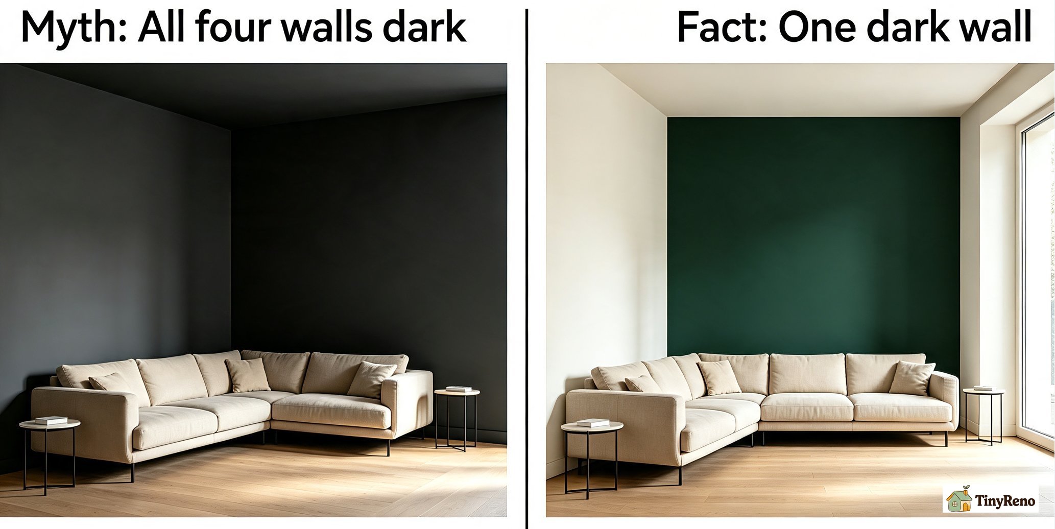
It changes the perceived size of the room, not the actual size. A deep saturated color on one wall makes the other three walls feel further away by comparison. This is the opposite of what most people expect — painting a small room dark usually makes it feel smaller. But only when all four walls are dark. With one dark wall and three light walls, your eye reads the room as larger than it is, because the dark wall recedes into shadow and the light walls advance.
I went back and measured my old living room after the terracotta wall went up. The dimensions didn't change. The room did.
It costs less than a couch. A single gallon of paint runs $25-40 at Home Depot or Lowe's. A basic roller kit is another $15. You probably already own a brush. Total cost: under $60 for a transformation that affects every minute you spend in the room. A new couch is 5-10x that and doesn't change the wall color.
It reverses in an hour. This is the renter-specific part. When you move out, one coat of the original paint color over the accent wall, rolled edge to edge, brings it back to a uniform color that matches the rest of the room. The landlord's paint touch-up person won't even know there was an accent wall. Provided you save a record of the original color (paint chip from move-in, photo of the wall in daylight) and use a similar enough finish, this works every time.
If you're renting and considering any paint project, an accent wall is the highest-impact, lowest-risk option.
Pick the Wall BEFORE You Pick the Color (Reverse of What Most Guides Say)
Every Pinterest board starts with the color. Every Pinterest board ends with the color looking wrong on the wrong wall.
The wall choice is a structural decision. The color choice is decoration. Picking them in the wrong order is why most DIY accent walls look like an afterthought instead of a design choice.
The right wall is one of these four, in roughly this priority order:
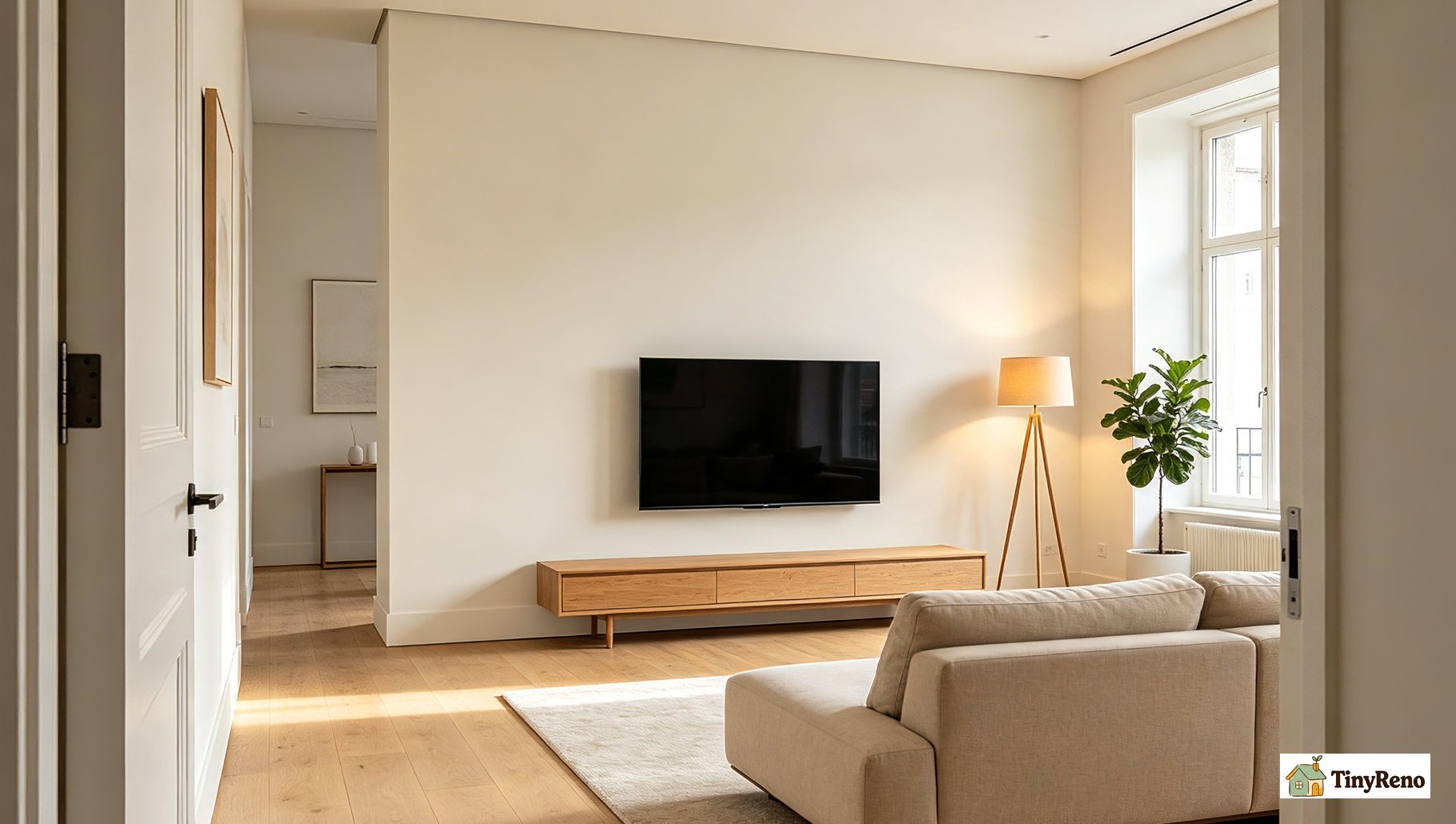
The wall you see first when you walk into the room. This is usually the wall opposite the door. An accent wall here is the first thing visitors see, and it sets the tone for the whole room. If your living room has a TV, this is usually the TV wall — which works fine, just make sure the wall is large enough that the TV doesn't dominate.
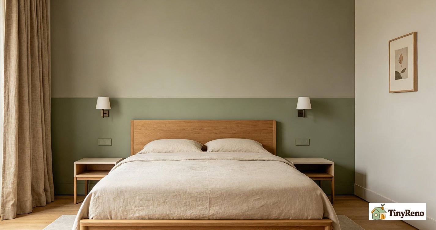
The wall behind the bed (in a bedroom). Headboard walls are the natural focal point of a bedroom. An accent color here pulls the eye toward the bed and makes the room feel intentional. Don't paint the wall the bed is pushed against if it's a small bedroom — the bed visually shrinks the wall and the accent color competes with the bedding instead of supporting it.
The longest uninterrupted wall. The one with no doors, no windows, no built-ins. The simpler the wall, the more impact a color change makes. A wall with a window in the middle gets visually broken up — the accent color reads as two panels instead of one.
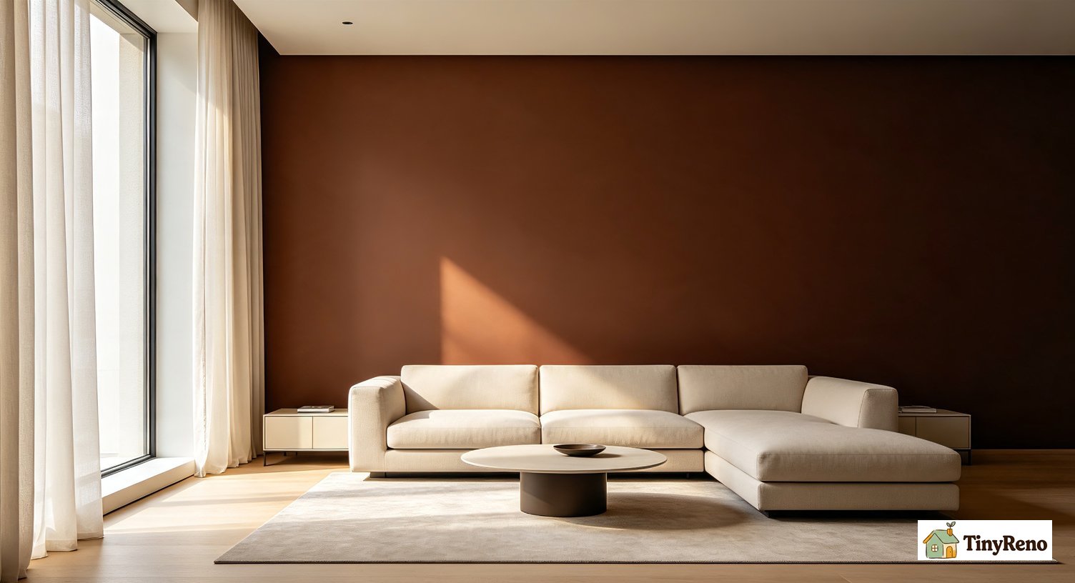
The wall opposite the largest window. Natural light hits this wall indirectly. Dark colors work better here because they don't compete with the light source.
The wrong walls for an accent color: any wall with a door (the door becomes a focal point instead of the wall), any wall shorter than 8 feet wide (too small to make the color change feel intentional), and any wall you can't see fully from anywhere in the room (the color gets wasted because nobody sees it).
Once you've picked the wall, you measure it. A typical accent wall is about 80-100 square feet — about 1/4 of a standard 12x12 room's total wall area. This matters because it tells you how much paint to buy.
The 10 Looks That Don't Date Themselves
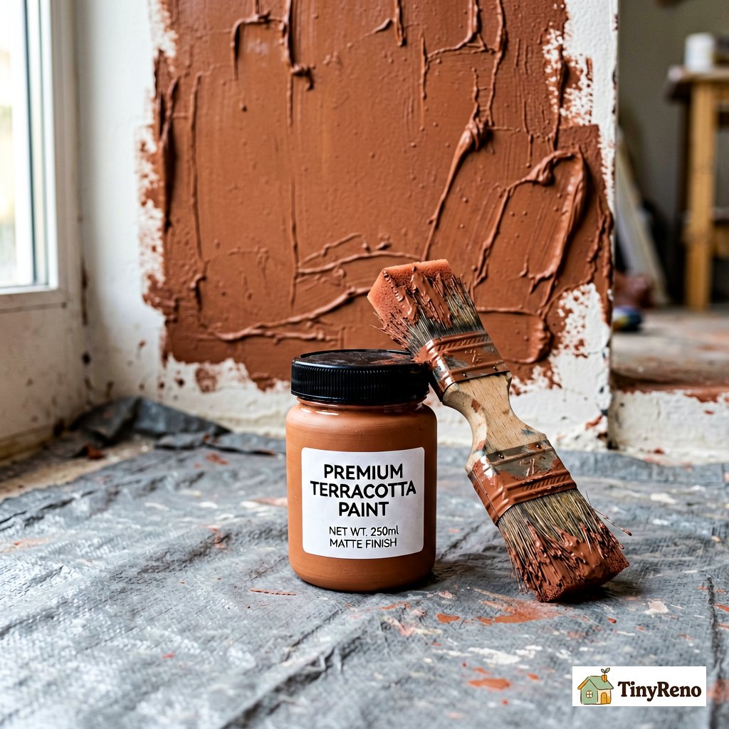
Here's a list of ten accent wall colors and finishes that have looked good for at least the last decade and will probably still look good in 2030. I'm skipping trendy colors (millennial pink, sage overload, moody everything) because those age out. I'm also skipping anything that requires a second coat of primer or specialty paint — this is renter territory, keep it simple.
Deep terracotta. My old living room color. Warm, earthy, works with cream and white furniture. Looks like a sun-baked wall in southern Italy. Reads as expensive even when it's $30/gallon paint.
Forest or olive green. Dark green is having a moment but it's been having it for 5+ years at this point, so it's not really a moment anymore. It just looks good. Pairs with natural wood furniture and linen.
Navy blue. Classic for a reason. Looks great with brass accents, white trim, and warm wood floors. The trick is to pick a navy that's slightly gray, not slightly purple — a purple-leaning navy reads as dated fast.
Muted blush or dusty pink. Works in bedrooms more than living rooms. Pairs with gray furniture and white bedding. Avoid anything too saturated or too cool-toned — those look like a nursery, not an adult bedroom.
Charcoal (not pure black). Charcoal has warmth that pure black doesn't. Works in living rooms and dining rooms, less common in bedrooms. Looks intentional with white trim and minimal art.
Warm cream or butter yellow. A very light accent wall — closer to off-white than to "color." Subtle but adds warmth to north-facing rooms that feel cold. Pairs with everything.
Mustard or ochre. High-impact, low-regret if you go muted. Reads as warm and grounding. Works with mid-century furniture especially.
Soft sage green. Lighter than olive, more gray than forest. Calming without being boring. Pairs with cream, white, and natural wood.
Brick or rust red. Bolder than terracotta. Works in dining rooms and studies. Pairs with leather, dark wood, and brass.
Deep aubergine or plum. High-impact for a dining room or bedroom. Don't use in a small north-facing room — the lack of light makes plum read as muddy gray.
Pick one. Buy a sample pot first, not a gallon. Paint a 12-inch square on the wall and live with it for three days. The color will look different at noon, sunset, and under artificial light, and you want to see all three before committing.
The 3 Colors That Look Good on the Chip and Terrible on the Wall
Three color families are notorious for failing the transition from paint chip to actual wall:
Pure black. Black paint chips look elegant and modern. Black walls look like a cave unless you have a room with very specific lighting — usually a south-facing room with bright natural light and lots of white contrast. Most apartments don't qualify. If you want the black accent look, go charcoal instead and save yourself the regret.
High-saturation primary colors. Pure red, pure blue, pure yellow. These are children's bedroom colors, not accent wall colors. They fight with everything else in the room and tire your eyes fast. If you want the effect of a primary color, mute it by 30-40% — brick red instead of fire-engine red, navy instead of cobalt, mustard instead of school-bus yellow.
Cool-toned grays. Gray has a temperature, and cool grays (blue-tinted, green-tinted) make rooms feel sterile and slightly sad. Warm grays (beige-tinted, taupe) work, especially in rooms with warm wood floors. If you want a gray accent wall, test the chip against your floor and furniture before committing.
The quick test for any paint chip: hold it next to a piece of white paper and look at it in the room where you'll paint. If the chip makes the white paper look dirty or off-color, the chip is too saturated for the room.
How to Pick the Right Sheen for an Accent Wall
Sheen is the glossiness of the paint. It matters more for accent walls than for whole-room paint, because an accent wall catches the eye and any sheen inconsistency shows.
Three sheens to consider:
Matte (also called flat). No shine. Hides wall imperfections. The most forgiving sheen and the easiest to touch up. Best for accent walls in low-traffic rooms — bedrooms, dining rooms. Downside: it scuffs and doesn't clean well. If you have kids or pets, avoid matte on lower portions of walls.
Eggshell. Very low shine, slight glow in direct light. The most popular sheen for accent walls because it balances cleanability with a non-shiny look. Works in any room.
Satin. Noticeable shine, more durable than eggshell. Good for high-traffic rooms or accent walls that might get touched (entryways, hallways). Downside: it shows every wall imperfection and every brush mark. If your wall has texture or you can't cut in perfectly, satin will make that visible.
For a renter doing one accent wall, eggshell is the right default. It looks like matte from across the room but cleans up with a damp cloth when the inevitable scuff happens.
If you want cutting-in tips so the line where the accent wall meets the trim and ceiling stays clean, I broke down the brush and rhythm [in this guide](/article/cut-in-paint-trim-without-tape) — the same principles apply whether you're cutting in around trim or cutting in around the rest of the room.
Undoing It When You Move Out (The Hour That Saves Your Deposit)
The accent wall you love today is the accent wall you repaint tomorrow when you move out. Plan for the undo before you start the do.
Three things to do at move-in, before you touch any paint:
Take a daylight photo of every wall in every room. Phone photo, natural light, no flash. This is your reference for the original color. Landlord paint touch-ups use whatever paint they have on hand, which may not match perfectly. Your photo helps you see the actual original color.
Save a paint chip from a hidden spot. Behind the fridge, inside a closet, anywhere paint isn't exposed to light. This is your color reference for the touch-up paint you'll buy at move-out.
Write down the finish. Matte, eggshell, satin — look at the original walls in raking light and note what you see. If your accent wall is eggshell but the rest of the room is matte, your touch-up will look slightly different even with the same color.
At move-out, the actual undo is straightforward:
- Buy a quart of touch-up paint in the original color and finish. A quart is enough for one accent wall. Cost: $10-15.
- Roll the accent wall with one full coat, edge to edge. Don't try to blend — just paint the whole wall.
- Let it dry 24 hours. Check it in daylight against the other three walls.
- If the color match is slightly off, do a second coat. Two coats of touch-up paint usually nails the match.
The whole process: 1-2 hours of actual painting, plus drying time. Compared to losing $200-500 of your deposit for "unapproved wall modifications," it's the best-paid hour of manual labor you'll ever do.
---
The terracotta wall in my old apartment came down in 45 minutes the morning I moved out. I rolled one coat of off-white over it, left the windows open to air it out, and the landlord's apartment inspector walked through two hours later and didn't say a word about it. I got my full deposit back the next week.
Discussion (0)
Sign in to join the discussion