

I painted my first two-color wall somewhere around 2019, in a 480 sq ft apartment with off-white upper walls and a sage green lower half. The line was supposed to be at chair-rail height — about 36 inches off the floor. By the time I got to the corner behind the door, it was at 34. By the time I got to the window wall, it had drifted to 38. I stood in the middle of the room with a wet brush in my hand and looked at the four-inch swing across 11 feet of wall and thought: this is what people mean when they say "Pinterest made it look easy."
It didn't have to be that bad. Most of the mistakes I made that afternoon — the drifting line, the bleeding under the tape, the color that came out two shades darker than the chip at Home Depot — are the same mistakes everyone makes the first time they try two-tone walls. None of them are hard to fix. You just have to plan them in the right order, which is what this article is actually about.
If you're renting, two colors in one room is one of the few "permanent-looking" treatments you can actually undo at move-out with a single coat of original-color paint over the whole wall. That's part of why it keeps coming back. The other part is that it does look good when it's done right.
The 3 Two-Color Wall Layouts That Don't Look Dated
There are basically three layouts people use, and the reason some of them look great and some look like a kindergarten classroom comes down to proportion.
Vertical split. One color on the left half of the wall, another on the right. Almost nobody does this in residential spaces because it cuts the room in half visually and makes the space feel smaller and a little unsettled. It's a commercial look — accent walls in restaurants, that kind of thing. Skip it unless you have a specific reason.
Horizontal split at chair-rail height. This is the classic "dado" or "wainscoting-style" two-tone. The line lands somewhere between 30 and 42 inches off the floor — roughly 1/3 of the way up a normal 8-foot wall. Bottom color is usually the darker or more saturated one (it grounds the room), top is the lighter. This is the most forgiving layout because the line is at eye level when you're sitting, and slight imperfections disappear behind furniture.
Horizontal split mid-wall. The line lands higher — usually around the midpoint of the wall, sometimes even 2/3 up. This is the "scandinavian modern" or "color block" look you see in design magazines. It's bolder and more architectural. It's also harder to execute well because there's more wall above the line, which means more chance for the eye to catch unevenness. I tried this one on a different wall and the line drifted worse than the chair-rail version because the eye has no chair rail or furniture to hide behind.
There's also a fourth option I should mention: accent walls where one wall of the room is a different color than the other three. That's not really "two colors in one room" in the way most people mean it, and it's a much easier project because there's no line to paint. If you're looking for the easy mode, do that instead.
Pick the Line Height BEFORE You Pick the Color
I know this sounds backward. Every Pinterest board starts with the color and then picks the line. That's why every Pinterest board also has a "first attempt at this" photo where the line is clearly an inch off level.
The line height is a structural decision. It depends on:
- Ceiling height (8 ft vs 10 ft changes everything)
- What's sitting against the wall (a couch, a dresser, a desk — anything taller than the line will hide it, anything shorter won't)
- The room's existing trim (if you already have a chair rail, you have a built-in guide)
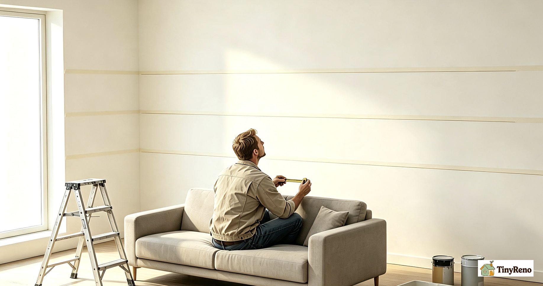
Here's what I do now. Before I buy any paint, I get a roll of painter's tape and stick a temporary line on the wall at three heights: 32 inches, 36 inches, and 42 inches. I live with each one for a day or two — yes, the tape stays up. I look at it from the doorway, from the couch, from the bed. The right height is the one that looks intentional, not the one that I measured and calculated.
The 36-inch mark is the most common default and works in most rooms with 8-foot ceilings and normal furniture. But if your ceilings are 9 or 10 feet, 36 starts looking pinched — bump it up to 42 or even 48. If you have baseboards that are taller than standard (5 inches or more), use the top of the baseboard as your starting point and add the chair-rail proportion from there.
Color choice comes after the line is locked. Once you know where the line is, you can sample the two colors in the actual room at the actual line height, and you'll see immediately whether they work together. Paint chips in store lighting will lie to you every single time. Sample pots on the wall will not.
Tape the Line, Then Walk Away for 10 Minutes
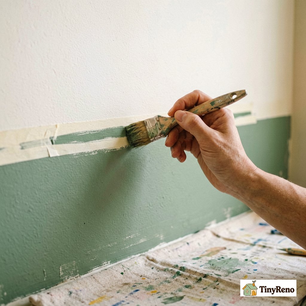
This is the step everyone skips. You tape the line, you immediately start painting, and 15 minutes later you're staring at bleeding edges and wondering what happened.
The reason you walk away is that tape needs time to seal. The adhesive on painter's tape is pressure-activated, and the few seconds you spend smoothing it down with your finger isn't enough. Tape needs 5 to 10 minutes of just sitting there before it forms a proper seal against the wall. If you paint over it immediately, the wet paint gets under the edge before the adhesive has set, and you get the dreaded bleed lines.
Ten minutes is annoying when you're in the middle of a project. Do it anyway. Go make coffee. Pet the cat. The wall will be there when you get back.
Two more things about tape that I learned the hard way:
Buy the good tape. Frogtape or 3M Blue (the actual "delicate surface" 2090 series, not the off-brand yellow stuff) costs about 50% more per roll than the cheap tan masking tape. It's worth it. The cheap tape has weaker adhesive and a fuzzier edge that bleeds. I used cheap tape on my second two-tone attempt and ended up having to repaint both sides of the line because the bleed was bad enough that I couldn't tell which color was which in places.
Press the edge, not the whole strip. When you apply tape, press firmly along the edge that's going to be against the other color. The center of the strip doesn't matter as much. Use a fingernail or the edge of a putty knife along just the seam.
Paint the Light Color First, Always
Conventional advice is to paint the dark color first, then tape over it and paint the light color on top. That's the advice I've seen in at least three different how-to videos. It is wrong for DIYers with brushes and rollers.
The professional spray-gun method is different from what you should do at home. With a sprayer, you can paint a perfect edge, tape over it cleanly, and not worry about bleed because the sprayer puts down an even coat in one pass. With a brush and roller, every stroke near a taped edge is an opportunity to push paint under the tape, no matter how careful you are.
Here's the order that actually works for brush-and-roller:
1. Paint the light color across the whole wall (both sides of the line) as a base coat. Let it dry fully.
2. Tape your line, pressing firmly along the edge that will border the dark color.
3. Paint the dark color up to the tape edge from below (or above, depending on your layout).
4. While the dark color is still slightly wet — not dripping, but not dry — peel the tape off at a 45-degree angle, slowly.
5. Touch up any spots where the dark color crept under the tape using a small angled brush and the light color.
The reason light-first works: if you have any bleed, it shows up as dark color on the light side, which you can see immediately and fix with the light base coat you already have on your brush. If you do dark-first and the light color bleeds, the bleed shows up as a faint lighter line on the dark side, which is way harder to fix and often requires repainting the whole dark section.
I learned this the third time I tried a two-tone wall. The first two were disasters because I followed the spray-gun advice. The third one came out clean because I ignored it.
The "Dry Brush Test" Most People Skip
Once you've finished painting both colors and peeled the tape, the wall looks done. It is not done.
You've got to wait. Most latex paint feels dry to the touch in 30 to 60 minutes. That's not dry — that's "the solvents have evaporated from the surface." Underneath, the paint is still soft and uncured for hours. If you start moving furniture back against the wall or putting tape over the line for any reason (like to touch up the other side), you can dent, peel, or smear the uncured paint.
The dry brush test: after about 24 hours, take a dry brush (no paint on it) and lightly run it along the painted line. If it leaves any visible mark on the wall — a faint scuff, a slightly different sheen — the paint isn't cured enough to put furniture or decorations against it. Wait another 12 to 24 hours.
The light test is even more important. Wait until the next day, then walk into the room when the sun is coming through the window at an angle. Look at the line from multiple positions. Any unevenness, any spots where the dark color crept under the tape, any wobble in the line — they all show up much more clearly in raking light than they do under normal overhead lighting.
This is also when you'll notice if the two colors look weird together at the line. Some color combinations look great as separate swatches and weird where they meet, because the eye reads the line as a color shift. I had this problem once with a warm cream and a cool gray — looked fine on the chips, looked like a paint store error at the line. Had to repaint the gray with a slightly warmer version. Sample pots exist for exactly this reason, and I learned to put them up at the actual line height, not just on the wall in random spots.
When Two Colors Fail (and One Wall is the Better Move)
I've done four two-tone walls in the last six years. Two came out great. One was okay. One I ended up repainting as a single color after living with it for a month.
The one I repainted was in a long narrow room — the kind of galley-kitchen or hallway-adjacent space where you can see both short walls from the doorway. A horizontal line in a long narrow room bisects the visual space and makes the room feel even longer and more tunnel-like. It was technically correct. It looked bad.
Two-color walls fail in three predictable situations:
The room is too narrow. If you can stand in the doorway and see the entire back wall, the line runs across your entire field of vision and dominates. Either make the whole room one color, or just do an accent wall.
The light is bad. Rooms with one small window or no direct natural light make two-tone walls look muddy because the eye can't resolve the contrast between the two colors well. Single color reads cleaner in dim spaces.
You picked two colors that are too close in value. Light beige and slightly darker beige look like a paint mistake, not a design choice. If you have to put the chips side by side under a lamp to tell which is darker, they're too close.
If any of those describe your room, save yourself the weekend and do a single accent wall instead. One wall in a contrasting color is the same weekend of work, looks intentional in any room, and is way easier to undo at move-out.
---
If you've done a two-tone wall and it didn't go the way you wanted, the most likely culprit is the line itself — height, straightness, or color contrast. Pick one of those to fix before you repaint the whole thing. The line is the wall. Everything else is just paint.


Discussion (0)
Sign in to join the discussion